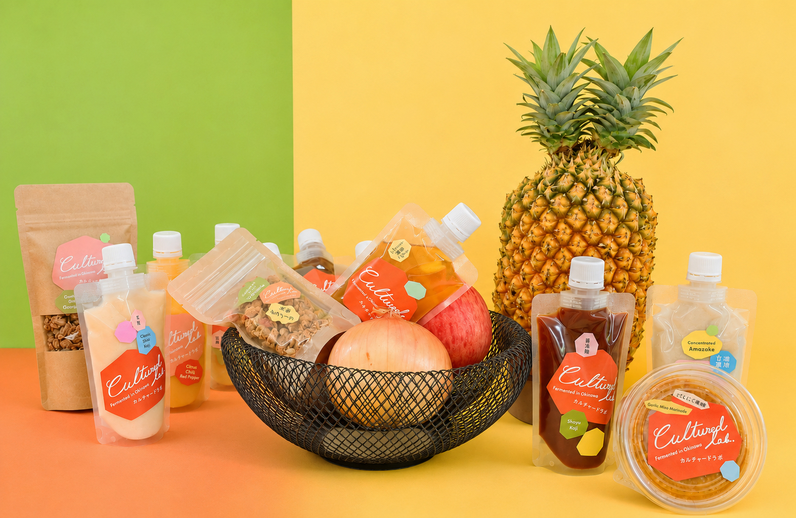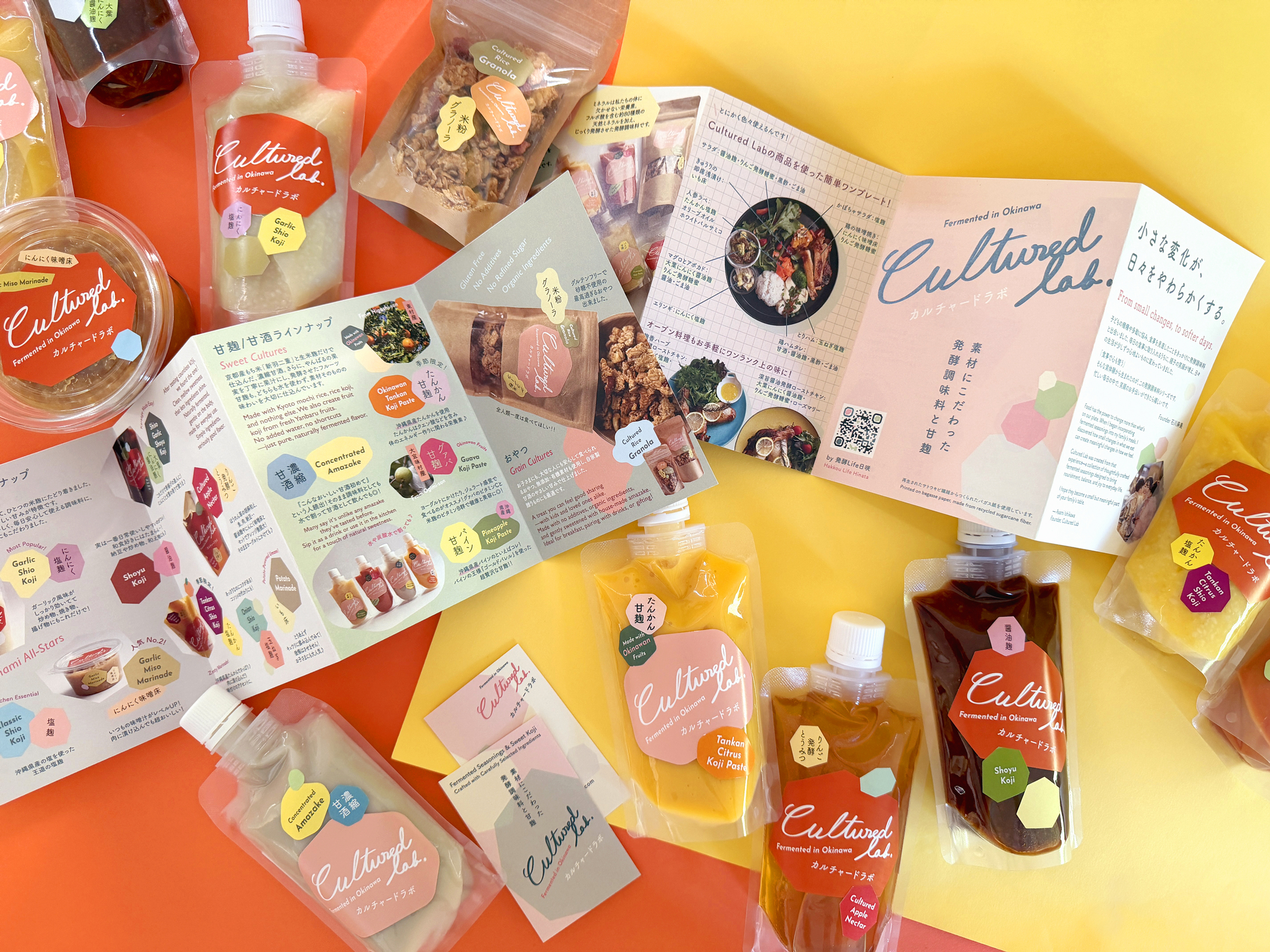

発酵調味料や甘酒などを展開する「The Cultured Lab」のブランディングとパッケージデザインを担当しました。
原材料にこだわり、手間暇をかけて丁寧につくられる商品の魅力を、どう自然に伝えるか。その背景にあるものづくりの姿勢も大切にしながら、デザインを考えました。
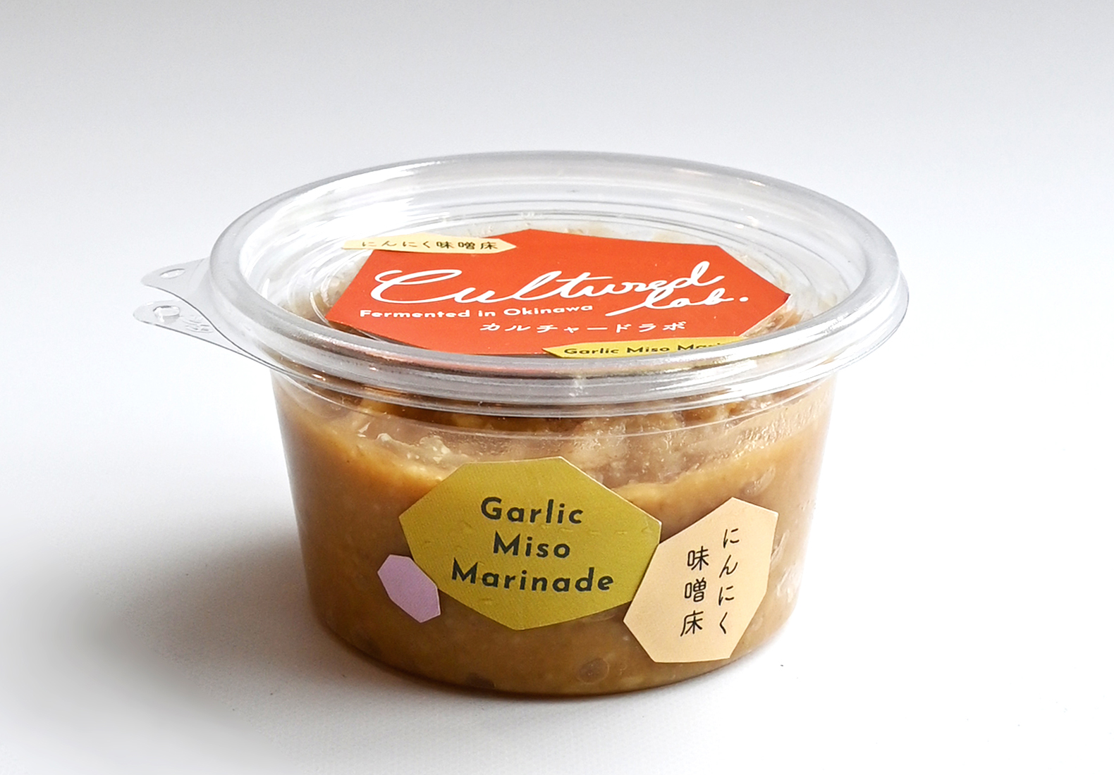
これまでのパッケージでは、ひとつひとつ手作業でステッカーを貼っていたため、「きれいにまっすぐ貼るのが大変!」という悩みがあったそうです。そこで、手作業だからこそ生まれる個性を、むしろデザインの魅力にできないかと考えました。
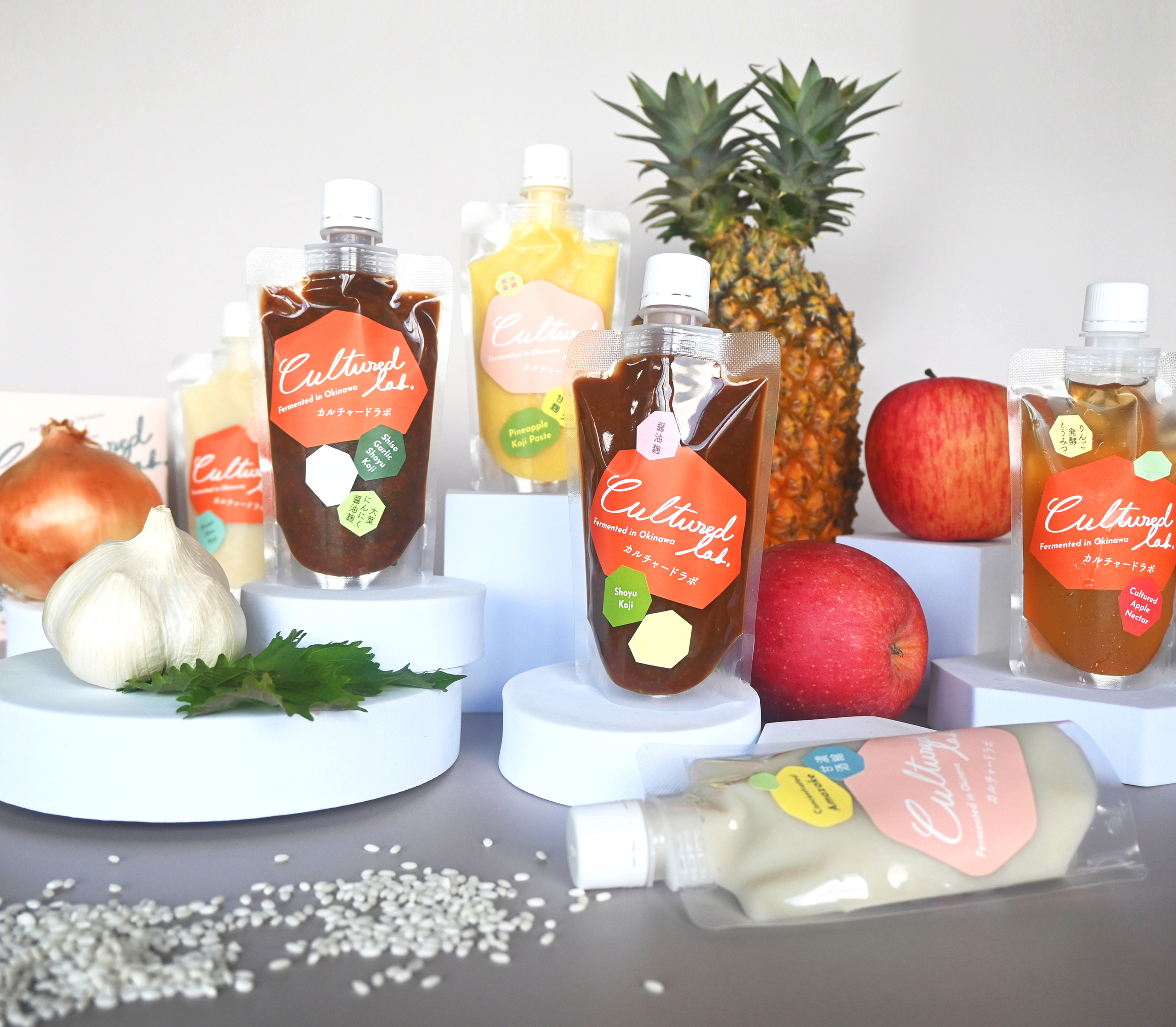
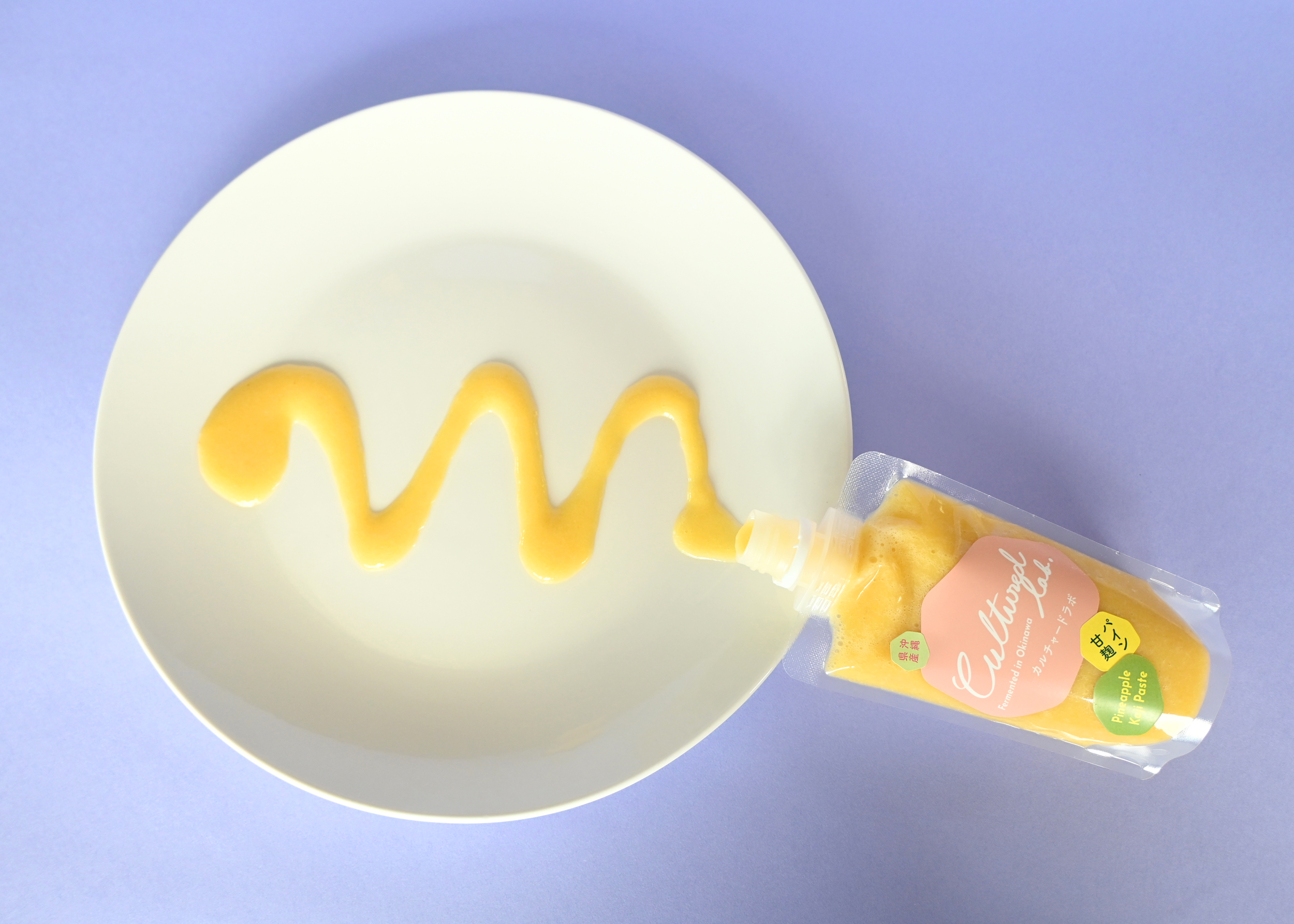
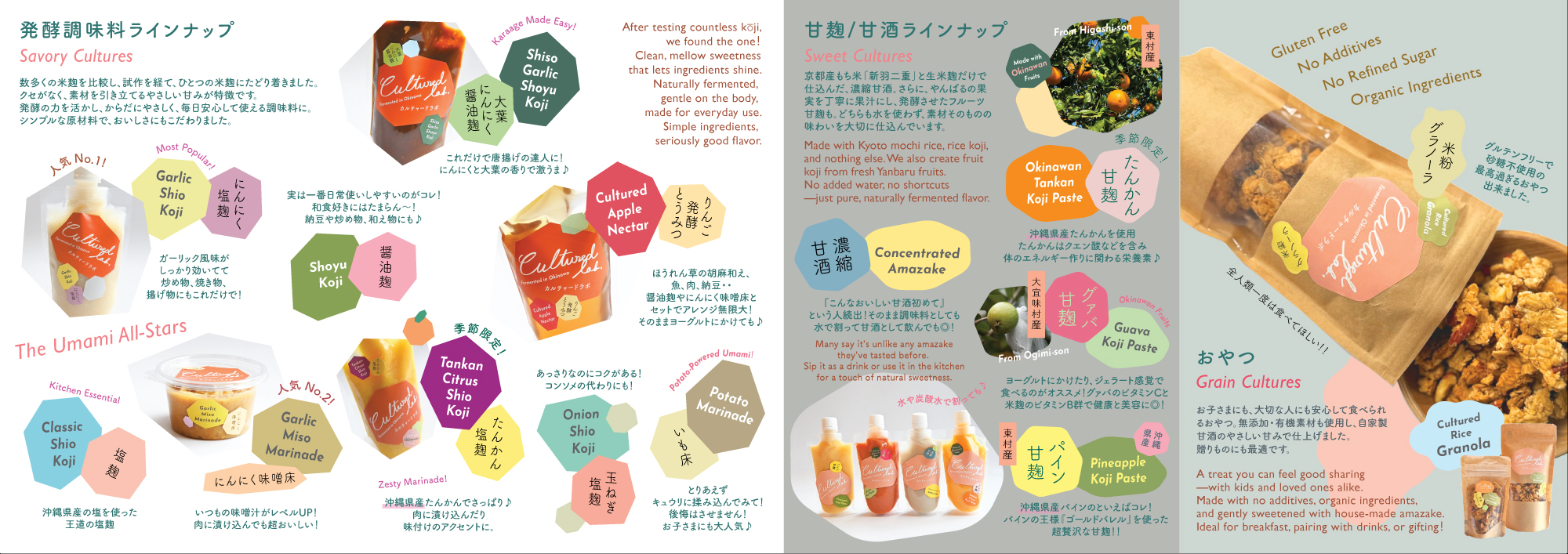
たどり着いたのは、ステッカーをまっすぐ貼らなくてもいい、という発想。 貼る位置や角度が少しずつ違っても、それぞれが自然にかわいく見えるデザインを目指しました。同時に、20種類以上ある商品を分かりやすく区別でき、効率よく展開できる仕組みも意識しています。
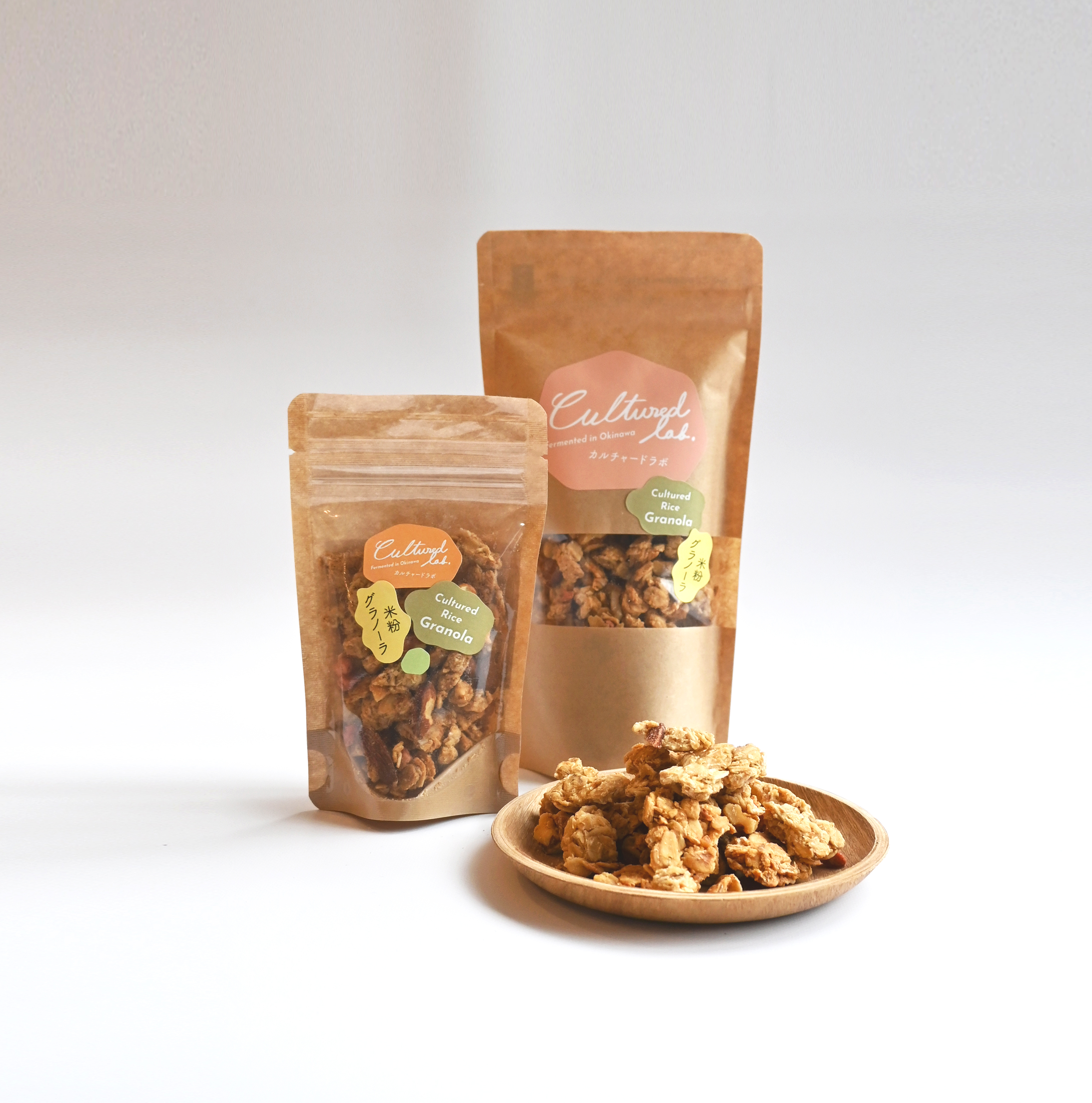
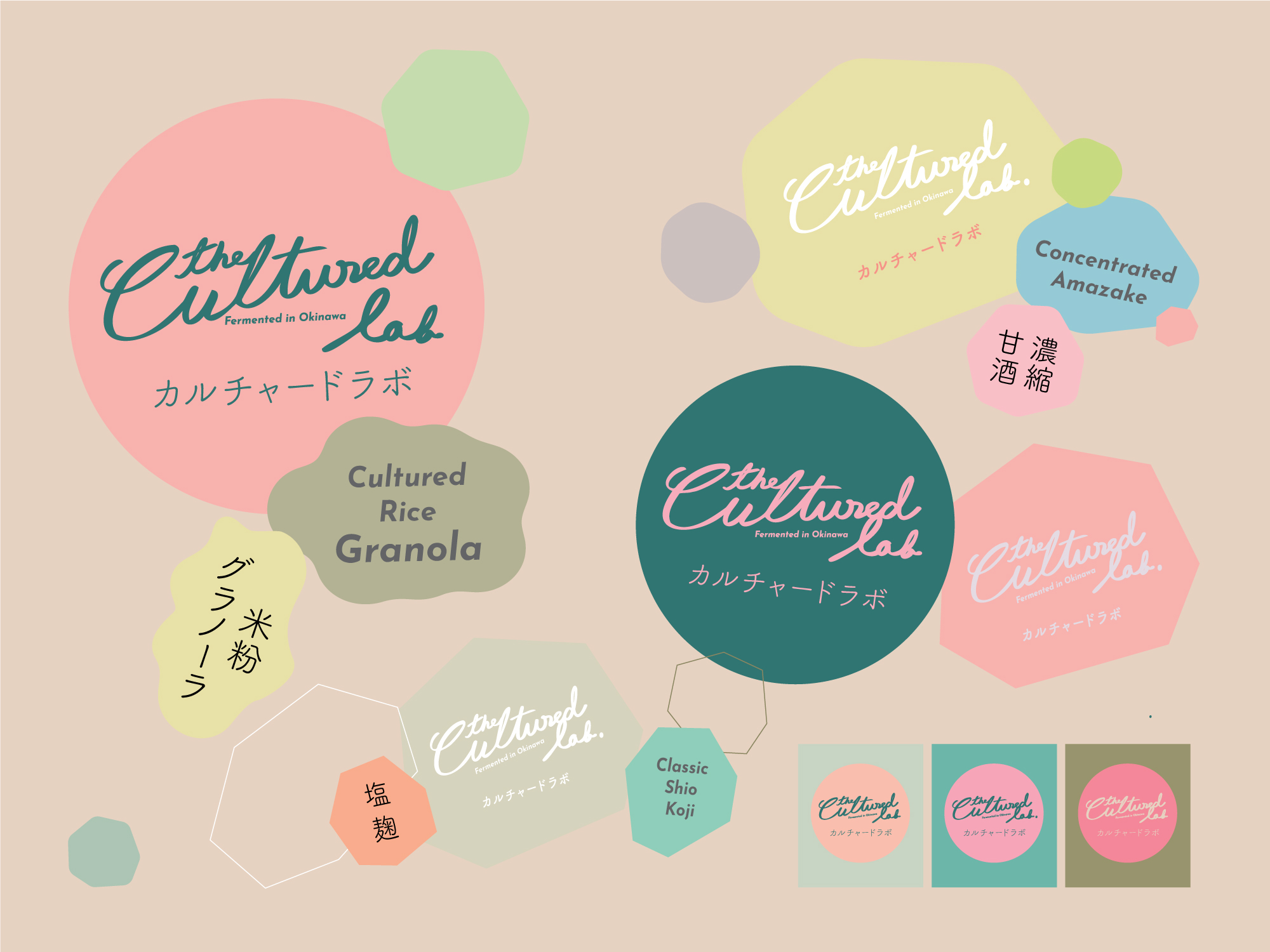
ラベルの形状は、酵素の立体構造や分子構造から着想を得た七角形がベース。調味料にはシャープな七角形、スイーツ系には角を丸くした形状を採用し、それぞれの個性を表現しました。
また、環境によって変化する麹の不均一さや揺らぎを表現するため、少しずつ形の異なるモチーフを組み合わせています。色によって商品の違いを直感的に伝えながら、日本語と英語の表記もグラフィックの一部として構成しました。
さらに、ステッカーシートの余白には無地の七角形ステッカーを配置。貼る際に自由に組み合わせることで、全体のバランスを調整できるようにしています。
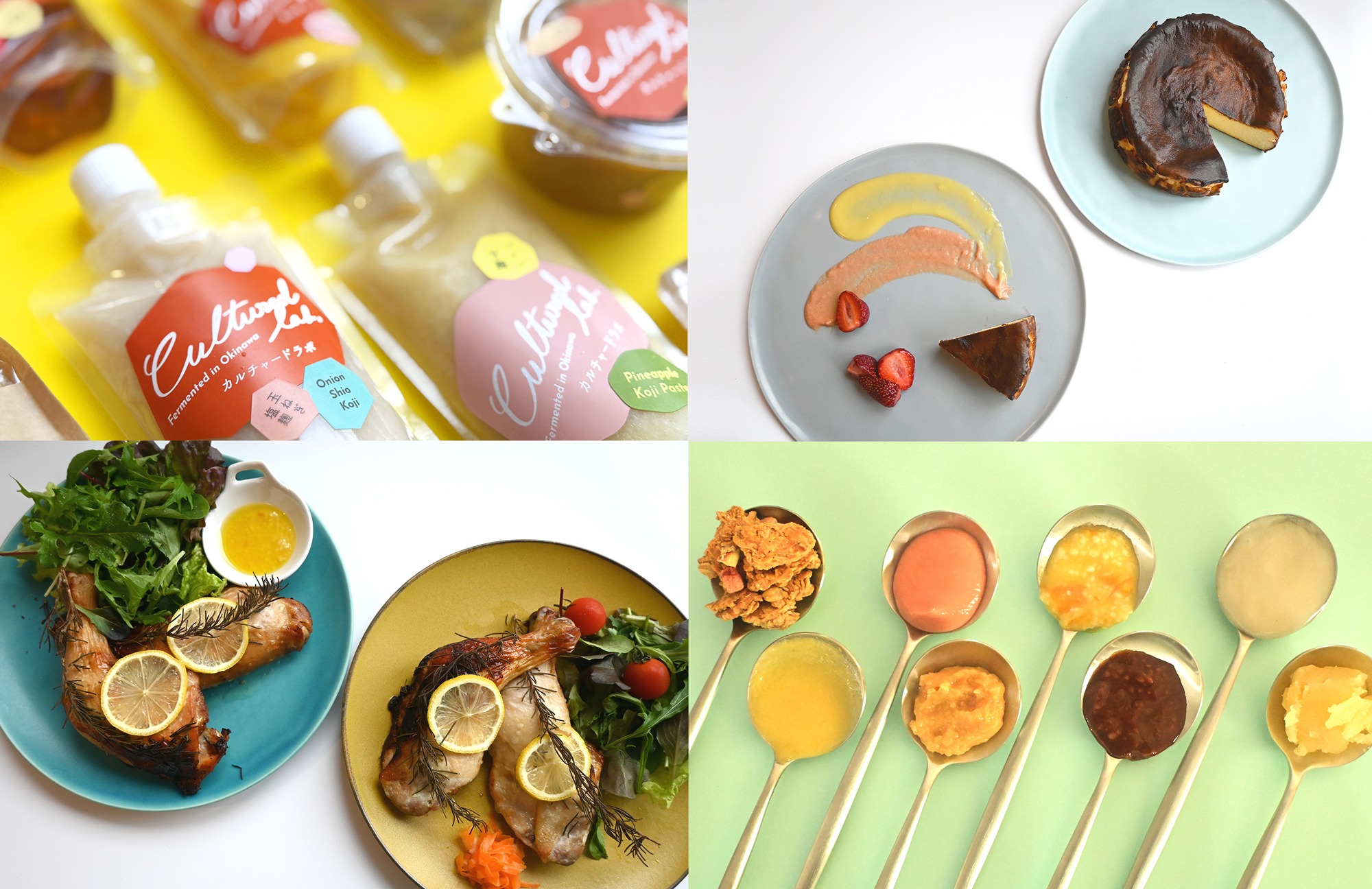
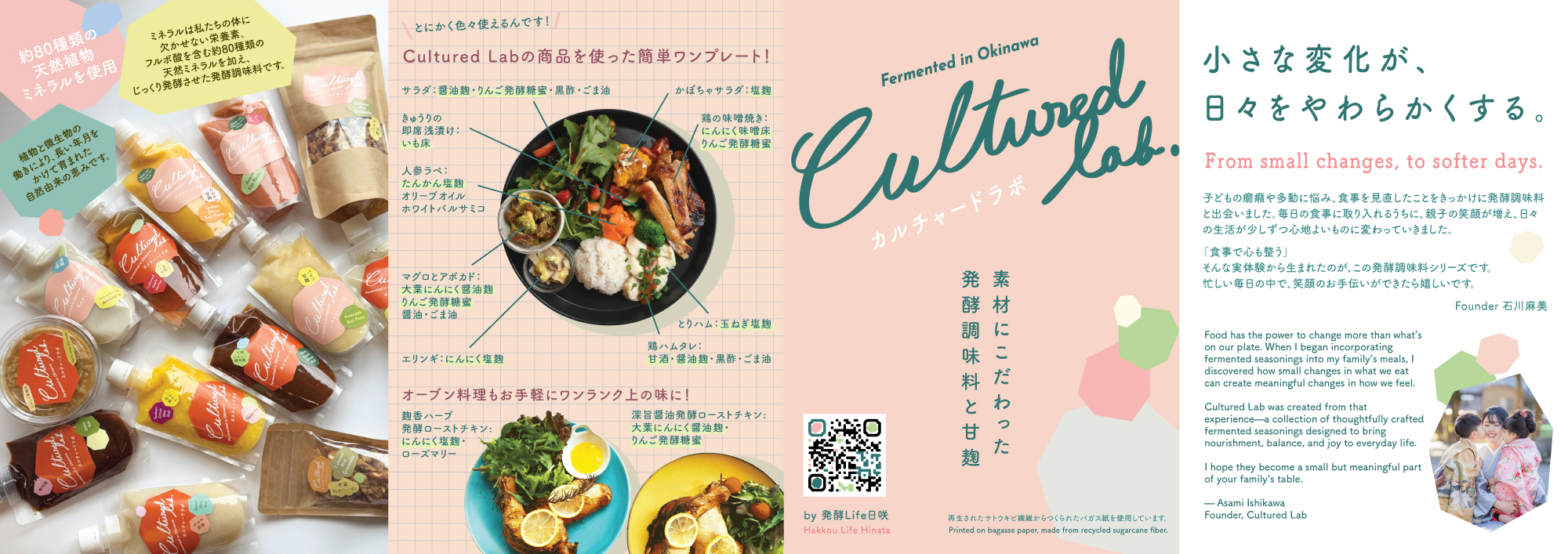
パッケージに加え、商品撮影やパンフレットなども手がけ、ブランドの世界観をさまざまな形で展開しています。
We worked on the branding and packaging design for The Cultured Lab, a brand offering fermented seasonings, amazake, and other fermented products.
How can design naturally communicate the appeal of products made with carefully selected ingredients, time, and attention? With this question in mind, we approached the project with a focus on reflecting the care and craftsmanship behind each product.
Previously, each label was applied by hand, and one of the challenges was getting the stickers perfectly straight. Rather than trying to eliminate these small imperfections, we saw an opportunity to embrace the unique character that comes with handmade processes.
This led to a simple idea: What if the stickers didn't have to be perfectly straight? We developed a design that looks naturally charming regardless of slight differences in placement or angle. At the same time, we created a flexible system that makes it easy to distinguish and efficiently manage more than 20 product variations.
The label shapes are based on heptagons, inspired by the three-dimensional structures of enzymes and molecular forms. Sharp-edged heptagons are used for seasonings, while softer, rounded versions represent sweets, giving each category its own character.
To express the organic variations and subtle irregularities of koji as it responds to its environment, we combined motifs with slightly different shapes. Colors help distinguish the products at a glance, while Japanese and English typography are integrated as part of the overall graphic composition.
We also made use of the extra space on the sticker sheets by adding blank heptagonal stickers. These can be freely combined with the main labels to adjust the overall balance, adding another playful and practical element to the packaging process.
Beyond packaging, we have also been developing the brand's visual identity through product photography, brochures, and other materials, bringing The Cultured Lab's world to life across different touchpoints.